IELTS Writing Task 1 samples are perfect for helpful IELTS writing practice and exploring the IELTS Writing Task 1 rubric.
[lwptoc]
IELTS Writing Task 1 Samples (Line Chart)
The graph below shows the differences in wheat exports over three different areas. Write a report for a university lecturer describing the information shown below. Write at least 150 words.
Answer:
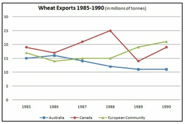
The line graph compares three regions in terms of exports of wheat between 1985 and 1990.
Overall, the three regions experienced different trends in the time period. While the wheat export in Canada and European countries rose with some fluctuations, the export in Australia fell over time.
As the graph shows, Australia’s wheat export figure started at 15 million tons in 1985 followed by a small increase to around 16 million tons in 1986. Then, it declined steadily until it fell to just over 10 million tons in 1990. Regarding Canada’s exports, in 1985 they shipped approximately 19 million tons of wheat. This figure fell to about 17 million in 1986, but then their exports experienced considerable growth to 25 million tons in 1988. Afterward, the figure plunged to below 15 million in 1989, but then subsequently rose to just under 20 million in 1990.
By contrast, the wheat exports from the European Community experienced an increase in the six year period. In 1985, nearly 16 million tons were exported, but this number fell to about 14 million in 1986. Then, the exports increased to exactly 15 million tons in 1987 and 1988 before witnessing steady growth to 19 million and 21 million tons in 1989 and 1990, respectively.
(209 words)
IELTS Writing Task 1 Samples (Bar Chart)
The chart below shows the amount of leisure time enjoyed by men and women of dif erent employment status.
Write a report for a university lecturer describing the information shown below.
You should write at least 150 words in 20 minutes for this task.
ANSWER:
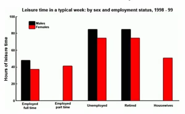
The bar chart compares the amount of free time per week that males and females of five categories of employment status had between 1998 and 1999.
It is clear that men enjoyed more hours of leisure time per week than women in three out of five categories. However, only figures for women are shown in two categories, namely employed part-time and housewives.
Regarding the full-time employed, obviously men had slightly more leisure time than women, with approximately 45 hours of free time per week, compared to around 38 hours for women. Obviously, unemployed and retired people of both genders enjoyed the most hours of leisure time. Moreover, the figures for retired males and females were exactly the same as those for the unemployed, at around 85 and 78 hours of free time per week, respectively.
Housewives enjoyed 50 hours of spare time, a little more than part-time working women who had just over 40 leisure hours each week. No data is given for men in either of these categories.
169 words.
IELTS Writing Task 1 Samples (Table)
The table below gives information about the average annual spending of university students in three different countries.
ANSWER:
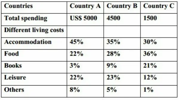
The given table compares the percentage of expenditure which college students from 3 countries spend on different living expenses each year.
Overall, the total spending of students in country A was higher than the expenditure of students in countries B and C. In all the countries, students spent the highest proportion of their budget on accommodation and food.
In country A, the total spending of students is highest, at 5000$ per year, compared with $4500 and $1500 for students in countries B and C respectively.
Accommodation accounts for 45% of the total expenditure of students in country A, while the proportions were lower for students in country B at 35%, and country C, at only 30%. However, in term of food, students in country C spend the largest percentage of their money on it, accounting for 36%. The figures for country A and B are only 22% and 28% respectively. Students in country C also spent a high percentage of their budget on books, at 21%, compared with 9% for students in country B and just 3% for students in country A. By contrast, students in countries A and B spent 22% and 23% respectively of their budget on leisure, while students in country C spent only 12% of their total money on this category.
196 words.
IELTS Writing Task 1 Samples (Pre Chart)
The pie charts below show the average household expenditures in Japan and Malaysia in the year 2010.
Summarise the information by selecting and reporting the main features, and make comparisons where relevant.
ANSWER:
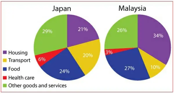
The pie charts compare the average household spending in Japan and Malaysia in terms of five important categories in 2010.
Overall, it is clear that Japanese and Malaysian people spent the largest proportion of their budget on just three categories, namely housing, food and other goods and services. Moreover, the expenditures on healthcare and transport in Japan were double the figures for Malaysia.
In Malaysian households, the greatest proportion of spending was on housing, which represented 34% of the total expenditure, while in Japan, the figure for this category was just 21%. Japanese householders spent the largest amount of their income on other goods and services, at 29%. Meanwhile, the rate of spending on this category in Malaysia was slightly lower, at 26%. In terms of food, the percentages of expenses for both nations were relatively similar, at 27% for Malaysia and 24% for Japan.
In both countries, the smallest proportion of spending was on health care. In Malaysia, this accounted for 3% of the total household expenses, while the figure for transport represented 10%. These figures were exactly doubled in Japan which were 6% and 20% respectively.
188 words.
IELTS Writing Task 1 Samples (MAP)
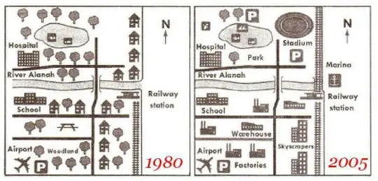
The maps show changes that took place in Youngsville in New Zealand over a 25 year period from 1980 to 2005.
ANSWER:
The maps illustrate the developments which took place in the coastal town of Youngsville between 1980 and 2005.
Overall, a comparison of the two maps reveals a complete transformation from a largely rural to a mainly urban area.
In the year 1980, the town was a much greener residential area with a large number of trees and individual houses, but during the next 25 years, the town saw a number of significant changes. The most noticeable is that all of the trees in the south of the River Alanah were chopped down, with all the houses along the railway line being demolished to make way for skyscrapers. Moreover, a new industrial zone with warehouses and factories sprang up around the school and airport.
In contrast, only a few trees in the north of the river remained. The woodland was cleared and converted into a golf course, a park, and car parking facilities. Further developments were the construction of a stadium next to the northeast corner of the lake and the extension of the railway line from the river running directly to the north. A Marina was also constructed at the mouth of the river.
194 words.
IELTS Writing Task 1 Samples (Process)
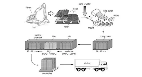
The diagram illustrates the process that is used to manufacture bricks for the building industry.
Summarize the information by selecting and reporting the main features and make comparisons where relevant.
ANSWER:
The flow chart shows the way in which bricks are made for the building industry.
Overall, there are 7 stages in the whole brick producing process, beginning with the digging up of clay and ending with the delivery of the bricks to the customers.
To begin, the clay used to make the bricks is dug up from the ground by a large digger. This clay is then placed onto a metal grid, which is used to break up the clay into smaller pieces. A roller assists in this process. Following this, sand and water are added to the clay, and this mixture is turned into bricks by either placing it into a mould or using a wire cut. Next, these bricks are placed in a drying oven to dry for 24 – 48 hours.
In the subsequent stage, the bricks go through a heating and cooling process. They are heated in a kiln at a moderate and then a high temperature (ranging from 200c to 1300c), followed by a cooling process in a cooling chamber for 48 – 72 hours. Finally, the bricks are packed and delivered to their destinations.
(188 words).
Natural Process
ANSWER:
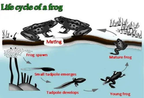
The flow chart illustrates the development of a frog from egg during its life cycle.
Overall, it is clear that there are six distinct stages illustrated in the process, commencing with producing eggs in the water and ending with the development of a mature frog.
The first stage is when the eggs, shown as frogspawn, float on the surface of the lake. The next step after this is the emergence of the small tadpole after the frogspawn hatches. At this point in the cycle, the small tadpole has a small body with a long tail. Over time, the tadpole grows and its body becomes bigger while the tail becomes longer. At the same time, the legs begin to form so as to prepare the tadpole’s future life on land. Eventually, the tadpole starts to grow into a young frog with a wider mouth, a shorter tail and larger legs although it continues to live in the water. Gradually, the frog becomes mature, ready to leave the water and moves onto the land. When being on land, it starts to breathe air and loses the tail. The final stage of the cycle is when the adult frog finds a mate in order to lay eggs. Having completed all these steps, the lifecycle will then begin again.
(215 words)